Award-winning! Crayola IDEAworks: The Creativity Exhibition
AVIXA, the Audiovisual and Integrated Experience Association, announced our project, Crayola IDEAworks: The Creativity Exhibition® as the 2021 AV Experience Awards winner for Best Personalized Experience. The award recognizes “innovative integration of content, space, and audiovisual technology to enrich experiences.” We are incredibly proud of the project team and their contributions that made this possible—Crayola®, Agency808, Leonid Productions, Primal Screen, XL Scenic, Samantha Osborne Design, and Mad Systems.
At the recent SEGD Experience Conference in Philadelphia, Cynthia, John, and Maris Ensing (Mad Systems) shared some of the behind-the-scenes details that went into the development of the exhibition, including the personalized visitor journey. Here’s a brief recap for those who missed the session.
If you haven’t experienced Crayola IDEAworks: The Creativity Exhibition at The Franklin Institute, check out this short video overview.
A Personalized Experience
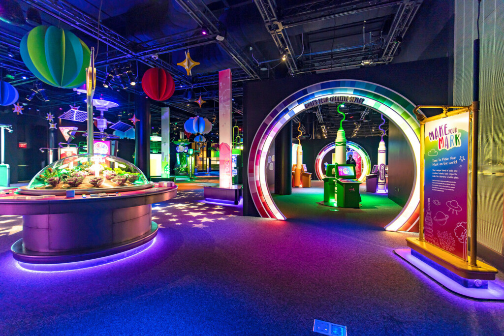
This exhibition is all about creativity—your creativity! Creativity is inside each of us—we just need to ignite it! Being creative isn’t just reserved for drawing and coloring. Through this exhibition, we took on the challenge of teaching guests that there are many ways to be creative—and that creativity is a skill that can be learned! The entire experience is based on teaching and empowering creative problem solving in a gamified hands-on way. To emphasize that everyone has different creative skills, each guest receives a unique outcome that gives them insight into their unique creative style at the end of the exhibition.
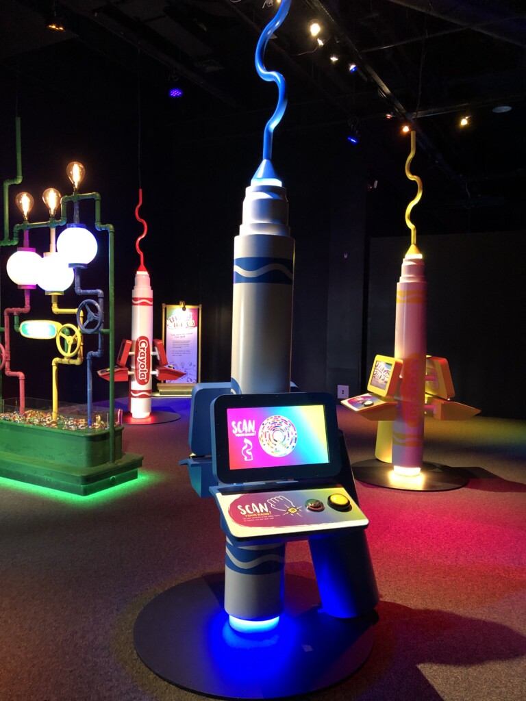
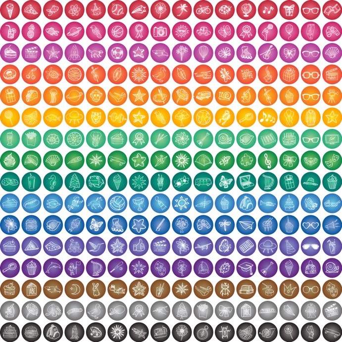
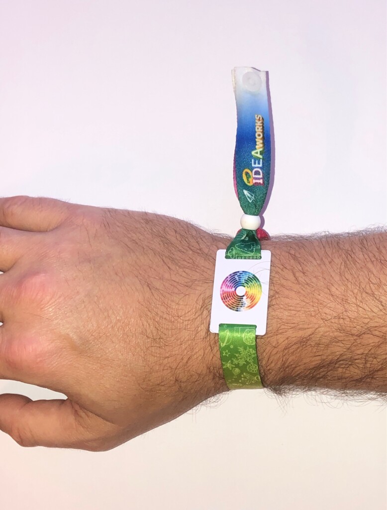
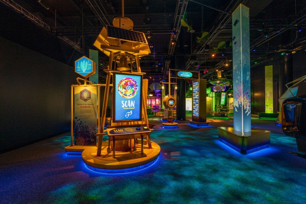
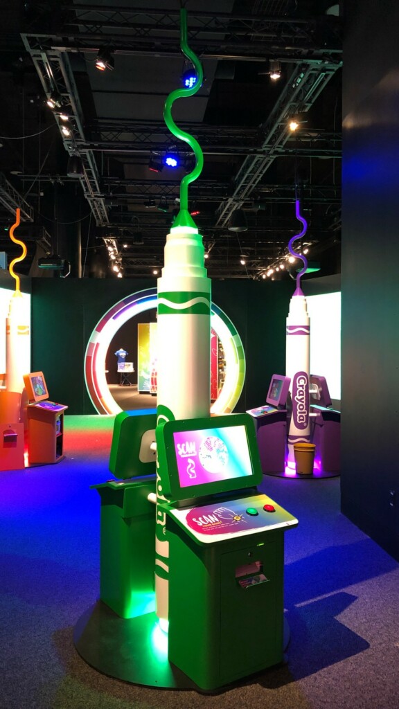
So how did we do this? When entering the exhibition, guests receive an RFID wristband and register it at an interactive kiosk. While registering, guests choose their favorite color and then a creative icon which becomes their avatar throughout the experience. This allows everyone to have a unique avatar and avoids concerns about collecting personal information. The registration process is streamlined so that each guest chooses from 16 colors and then one of 16 unique icons associated with that color. This equates to more than 256 options, allowing each visitor to choose an individual identifier that is tied to their wristband and accompanies them through the exhibition.
Click here to watch a video of the registration process.
The IDEA Workshop
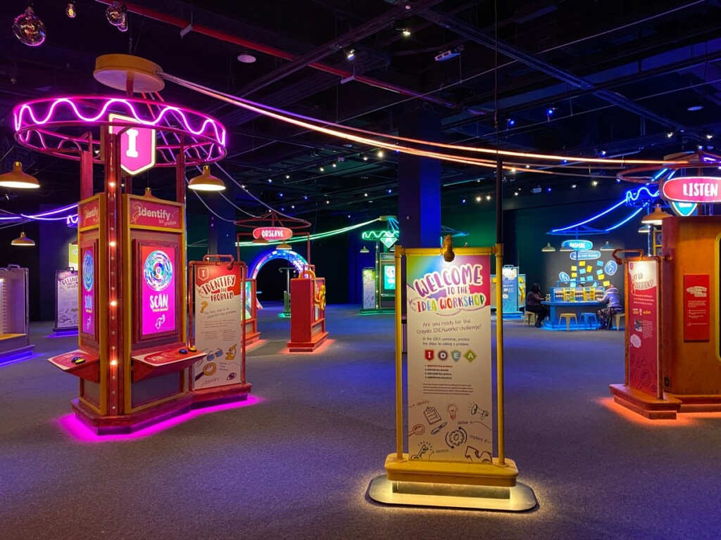
The first stop in the exhibition is the IDEA Workshop. At stations throughout the space, guests learn the I-D-E-A steps behind creative problem-solving—I – Identify, D – Define, E – Explore, and A – Assess. At each of the four stations, guests answer two questions about their creative style preferences. With short video segments featuring the clever Crayola Craymoji® characters, guests explore each step of the creative process and collect a digital badge linked to their RFID wristband—this also helps to identify each guest’s creative style. Problem-solving skills are reinforced through interactive challenges and fun, hands-on experiences like completing puzzles, drawing challenges, and building with pool noodles.
The Colorverse
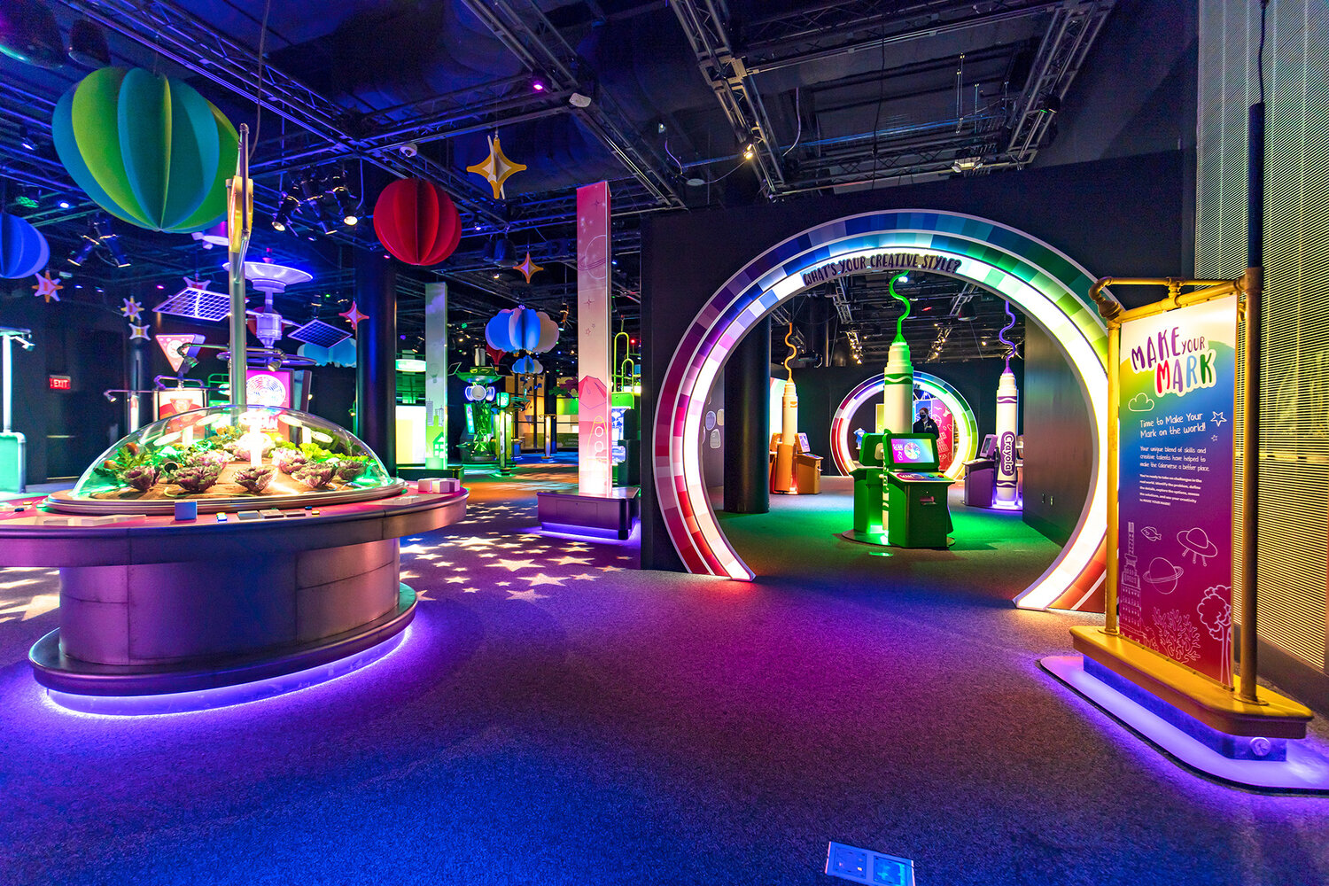
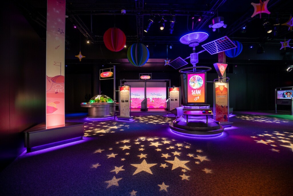
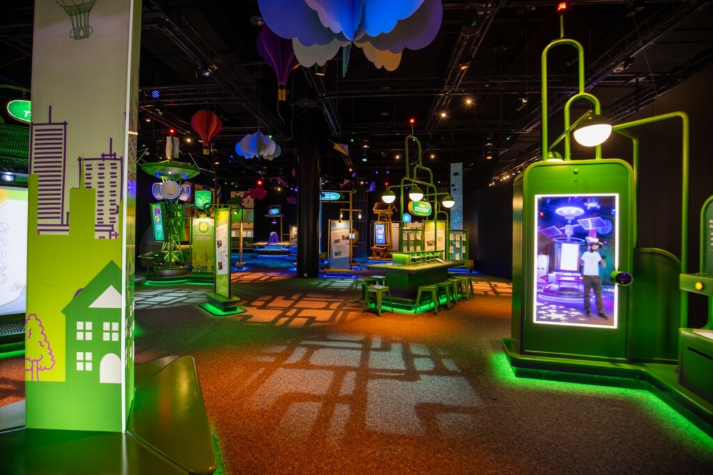
Once guests collected their four badges in the IDEA Workshop, they are ready to venture through the Color Wheel Portal and into the Colorverse® where they will use their new I-D-E-A problem solving skills to help solve complex problems based on real-world problems supported by current scientific research—such as balancing a coral reef ecosystem, growing food on Mars, or fixing city infrastructure problems in Crayopolis. Then, after just a few more creative style questions, guests are ready to jump through the Color Wheel Portal again to complete their journey.
The Grand Finale
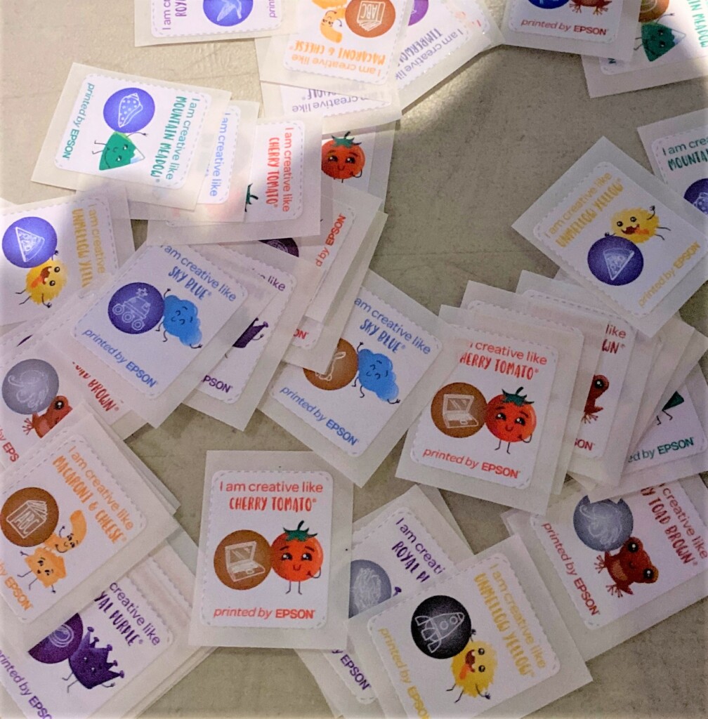
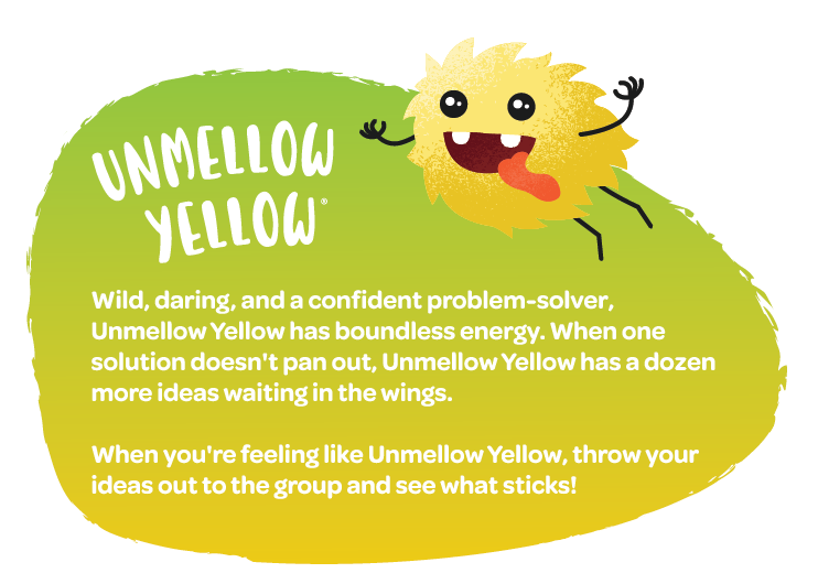
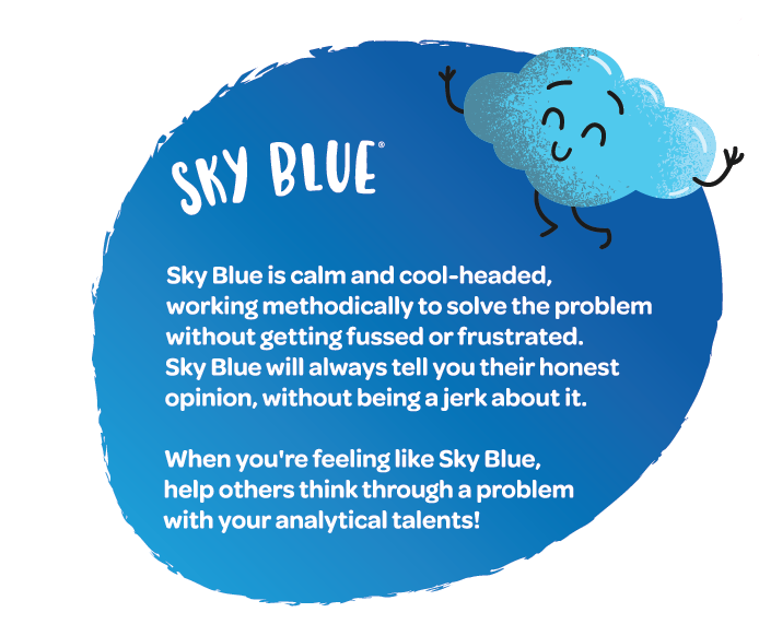
In the Grand Finale, guests scan their wristband one last time for a summary of their creative strengths. The final kiosk prints out a sticker with their chosen icon and pairs them with Craymoji character that best matches their creative style.
The design of the creativity quiz was challenging for our team. The questions needed to be relevant to the skills we wanted guests to learn, be appropriate for all ages, appeal to all learning types, and be loads of fun. We wrote, revised, and re-wrote questions—as well as creative profile summaries—that were insightful and short, yet universal. Our collective years of reading our horoscopes for fun finally became useful! Because of Covid-19, we were not able to survey future guests in-person, so we created a web-based version of the quiz and sent it to friends and family to test.
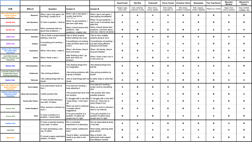
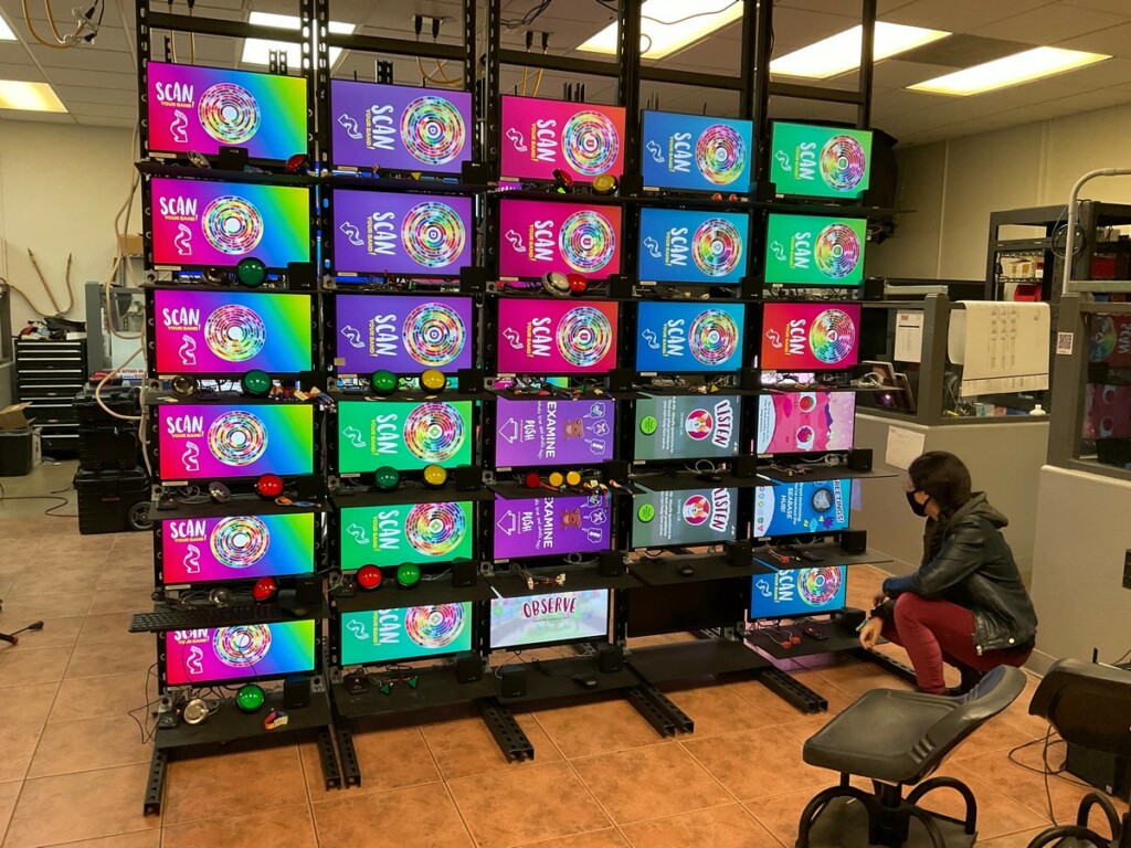
Once we were happy with the results, Mad Systems got to work to translate the quiz into a format that worked for the exhibition using their Quicksilver® technology. A central database—connected wirelessly to all of the kiosks—enabled wristband registration, recorded each chosen color and icon, logged the quiz responses, and produced a creative style outcome based on the guest’s choices in the exhibition. All this needed to happen in real-time, on more than 50 computers spread over 17,000 square feet with hundreds of visitors interacting simultaneously. Did we mention that all of this work was completed remotely during a pandemic? This hindered our ability to do testing on the actual equipment with large numbers of users, but we did as much testing as we could in Mad System’s lab.
The User Experience
While the creativity quiz was an integral part of the experience of the exhibition, we recognized that it needed to be fun and engaging to motivate guests to visit seven stations and answer 14 questions to collect all their digital badges. So, we spent a lot of time collaborating with our project team (specifically, Agency808, Primal Screen, and Leonid Productions) to create wireframes of the user experience and fun animations with Craymoji characters to accompany the content. The characters presented a unique challenge of their own—Crayola created the Craymoji characters for use in print media, but they had never been animated. Our project team collaborated with Crayola to determine how the characters should move, gesture, and interact in ways that matched each of their unique personalities.
We also worked to make the experiences more engaging by using physical buttons and knobs rather than using touchscreens, so that the interaction would be more tactile and fulfilling experience. For a little added whimsy, we decided that all of the sound effects within the exhibit would be onomatopoeias. So instead of bloops and dings, we had a voice over artist record the words “bloop,” “ding,” and “da-da-da-DA!” We hoped that all of these elements together would communicate the energy and mood that we intended for guests, as well as represent the Crayola brand in the right way.
The Real Test
We learned so much from observing visitors within the first few days of the exhibit opening. While we didn’t get everything perfect, we were quite pleased with the result and were able to make some improvements right away with media and graphics revisions through some onsite evaluation. We recently visited the exhibition to see how it was holding up and were excited to see everything was still working as intended. We’re grateful to our The Franklin Institute, Agency808, and Mad Systems for keeping this project looking and working so great.
We drew on our many years of experience developing exhibitions to create Crayola IDEAworks: The Creativity Exhibition. We anticipated the need of the exhibition to be modular to travel, planned for backups and spares, designed multiple stations for an expected capacity of more than 450 visitors per hour, and used lighting to create a “wow” factor… but there some things that just didn’t anticipate. Because of COVID-19, there were limits on travel and our team’s ability to meet in-person. The exhibition was fabricated in Canada and our US-based team couldn’t visit the shop to see progress and resolve challenges in person. Supply chain issues delayed materials and A/V equipment was damaged in shipping. Even though we couldn’t we test exhibits with in-person visitors, we found ways to prototype in our own homes, over zoom, and even enlisted our social media circles to test activities with their children. The installation at the Franklin Institute was stressful and hectic since nearly all of the A/V integration had to happen onsite instead of at the fabrication shop. Shipping delays and snow days were hurdles we wish we could have avoided, but our team worked tirelessly to make sure we hit our opening date—and we did. Finally seeing guests interact and have fun with these experiences we had spent so much effort developing over 14 months was so satisfying and cathartic.
If you’ve had a chance to visit Crayola IDEAworks: The Creativity Exhibition, please reach out to us and let us know what you think! There are so many more great experiences within this project that we wish we could include here. We’ll feature separate interactives future blog posts.
Thank You!
This award was made possible through the work of many talented collaborators. We were fortunate to work with a very talented team!
